
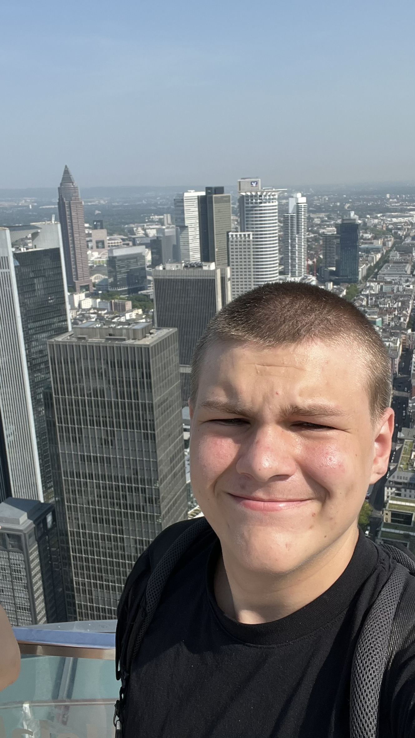
🎓 I’m a student from the 🇨🇿 Czech Republic who loves technology 🖥️, traveling ✈️, space 🚀, politics 🗳️, video games 🎮, skyscrapers 🏙️, photography 📸, and more!
🤔 I’m not entirely sure what to do here yet, but I wanted some place to:
📝 Share random blog posts about my IT adventures
📂 Showcase my portfolio
🖼️ Display some of my gallery photos
✉️ Add a contact page
- Rokytnice nad Jizerou – Skiing trip
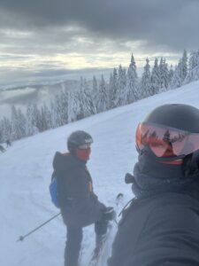 I love skiing. Its one of (if not) the best sport. I would much rather ski for 8 hours, pay 40 euros on not so good burger, and have absolutely destroyed legs, then train in the full body in the gym. So in short, I like skiing, so I went with my sister and younger brother to Rokytnice nad Jizerou Rokytnice nad Jizerou on Google Maps It all started in 6:20 in the morning. When my alarm didn’t rang.So it actually started in 6:30, when i was woken up by my sister. I was pretty tired from trying to fix… Read more: Rokytnice nad Jizerou – Skiing trip